


.svg)


.svg)


.png)

.png)
Something I find quite frequently within Datadog is an overabundance of dashboards. That’s not to say that having a lot of dashboards is a bad thing; sometimes it’s necessary! What I’m talking about is a lot of dashboards that are duplicated, but don't need to be. Most times this is an easy fix - we take a solid dashboard and use template variables to make them a bit more dynamic. Instead of having a dashboard for dev, staging, and prod, we make one that has an $env variable that we can just swap and have the graphs change accordingly.
But…there’s one spot where this isn’t going to work as well, and that’s when it comes to APM metrics. In the metric summary page, if we take a look for trace.* metrics, we’ll see something like this:
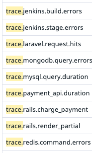
And if we were to look a little closer…

We’re looking at the metrics sent by the Datadog Tracer Agent. These are used to make the basic APM service visualizations that you have access to via the service summary page. On closer inspection of these metric namespaces, we’ll see that after trace we have the name of the submitting service, and after the service name we have all sorts of different breakdowns of the metric values (like duration, errors, etc). If we’re running an environment that is solely based around a few technologies, it may be totally acceptable to create a dashboard using these metrics.
However, what happens when we’re in an environment that has numerous types of caches, databases, and microservices written across a number of languages? We will need to create a dashboard for each type of service to view JUST basic HTTP metrics, meaning we need to sort through hundreds of metrics, determine what they are and what they mean, and then lay them out on a dashboard. In large environments, this is very difficult to maintain, and creates a higher barrier to entry for monitoring a new service. So how do we fix this?
Datadog offers APM Retention Filters; by enabling this globally or for certain services, Datadog performs an analysis of APM data and allows us a universal dashboard widget that allows us to perform calculations that are (effectively) service agnostic (As a note - Retention Filters have a certain amount of retained traces that are included in your subscription, but additional charges will apply once that threshold is crossed).
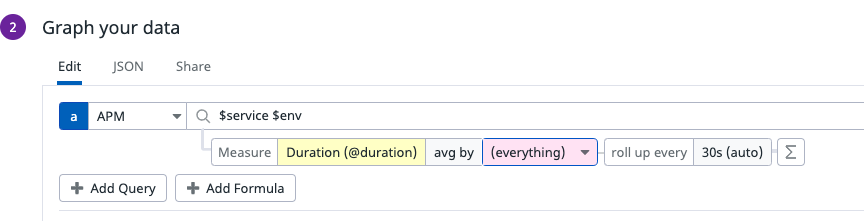
Before enabling Retention Filters, our dashboard panels would look something like this:
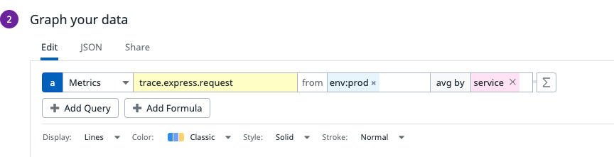
After Retention Filters….
Furthermore, this panel gives us a significant number of options to filter, arrange, and calculate our data.
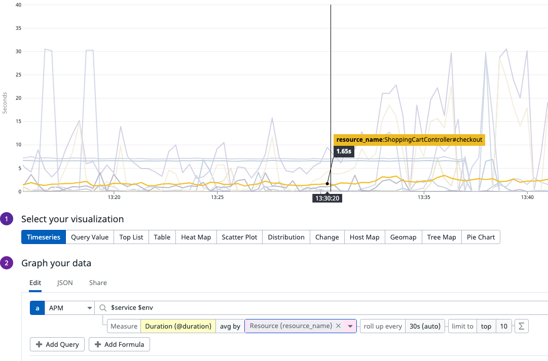
By adding a simple split by Resource on this panel, we can now see the average duration of requests against every different resource name presented by this application. While this is a simple example of the use case, the power here comes from not having to know or care about the name of the metric (is it trace.http.request.duration? Or is it trace.rails.request.duration?), which allows you to easily set variables for $service and $env and dynamically switch between different services and environments.
The end result can be a singular dashboard that shows you everything that you would care about at a high level for any application - request latencies, errors, http error codes, and so on - without having to create and maintain multiple bespoke dashboards for every individual application. You can share this dashboard among any application team and have them get the same information as everyone else! The cherry on top, though? Any new app now has a dashboard with no additional effort or turnaround time, reducing your engineering time and streamlining the go-live process.